

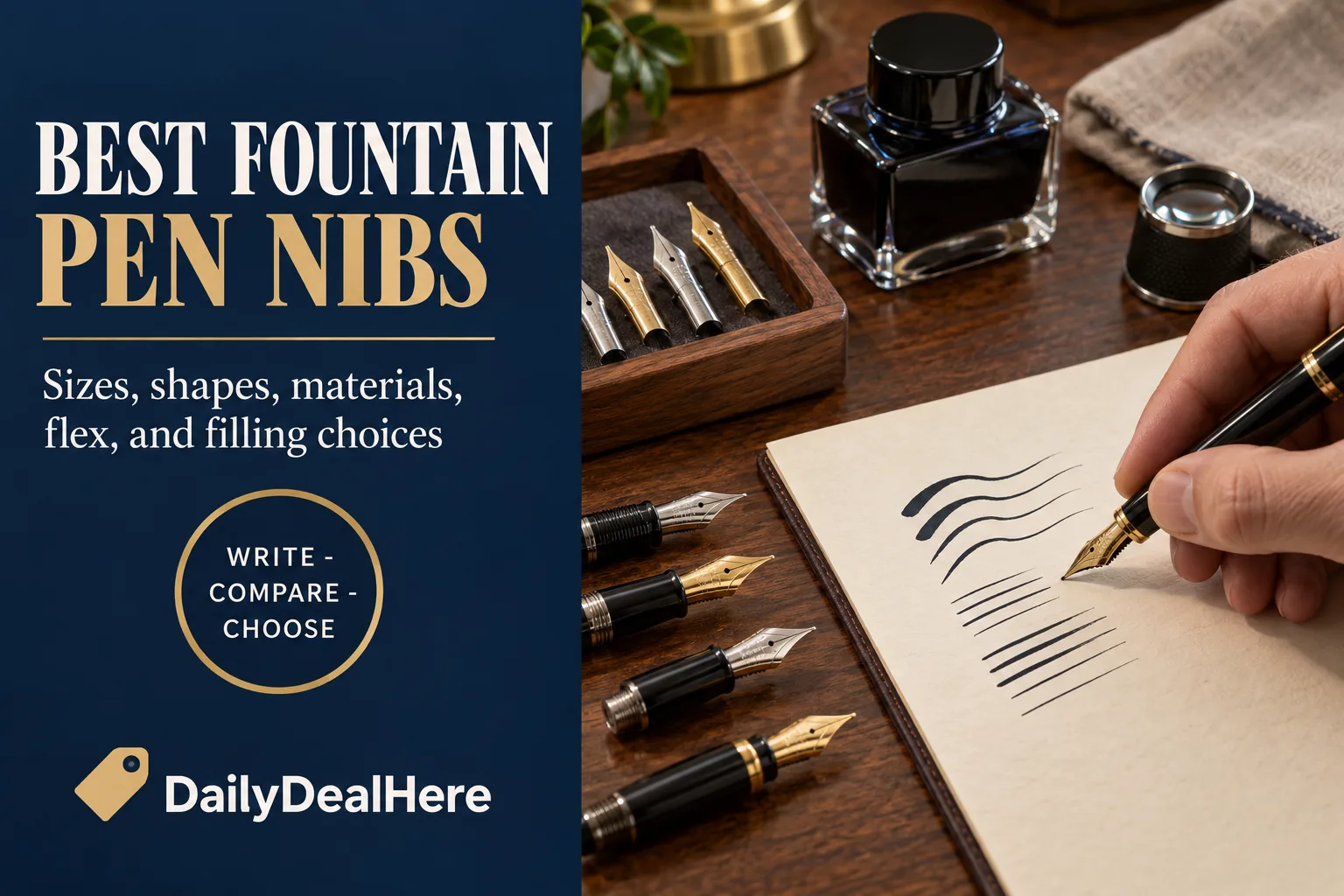
The best fountain pen nib is the one that matches your handwriting, not the one with the most gold in it. For most people that means a fine or medium round nib in steel or 14K gold. Small, tight handwriting is usually happiest with a Japanese extra fine or fine. Anyone who wants character in their lines without learning a new technique should look at a stub. Flexible nibs and eyedropper pens are wonderful, but they are specialist tools with real tradeoffs, and both reward a little homework before you buy.
This guide explains how nib sizes really compare between brands, what separates round, stub, italic and oblique nibs, whether gold is actually better than steel, what flex nibs can and cannot do, and what living with an eyedropper filler involves. Most of the technical detail comes from the reference library of nib technician Richard Binder, whose articles on nibs, materials and flex we read in full, supported by the Wikipedia entry on nibs and the Goulet Pens guide to eyedropper pens.
The short answer
- Best all around nib: a fine or medium round nib. It writes in every direction, forgives an imperfect grip, and suits everyday notes.
- Best for small handwriting: a Japanese extra fine or fine, since Japanese nibs run finer than Western nibs of the same label.
- Best for easy line variation: a stub, which adds thick and thin strokes while writing nearly as easily as a round nib.
- Best for calligraphic lettering: an italic, crisp for precision or cursive for everyday speed.
- Best material: Richard Binder ranks 14K gold first, with 18K good but not the very best, and steel much less costly but still very good.
- Best for dramatic, personal line variation: a true flex nib, usually vintage, used with a light and careful hand.
- Best for ink capacity: an eyedropper pen, which uses the whole barrel as the ink reservoir.
The rest of this article explains each of those choices and the traps that come with them.
How a fountain pen nib works
A nib is a shaped piece of metal split down the middle into two tines. Ink travels from the feed underneath, up through the slit and onto the paper by capillary action. Near the base of the slit is the breather hole. Wikipedia describes it as letting air into the feed and back up to the ink reservoir, and also acting as a stress relief point that stops the nib cracking lengthwise from the end of the slit after repeated flexing.
At the very tip is a small pellet of hard, wear resistant alloy, usually called tipping. This is the part that actually touches the paper, and its shape determines whether a nib is round, stub or italic. The body of the nib, meanwhile, determines how stiff or springy it feels. Keeping those two ideas separate makes every other choice easier. Tip shape controls line character. Nib body controls feel and flex.
Binder also points out a detail that separates good nibs from mediocre ones. A straight slit, with tines the same distance apart along their length, works reasonably well. Better nibs are hand finished with a slight taper, so the tines sit a little closer together at the tip than at the breather hole, and that taper encourages more reliable ink flow.
Nib sizes, from extra fine to double broad
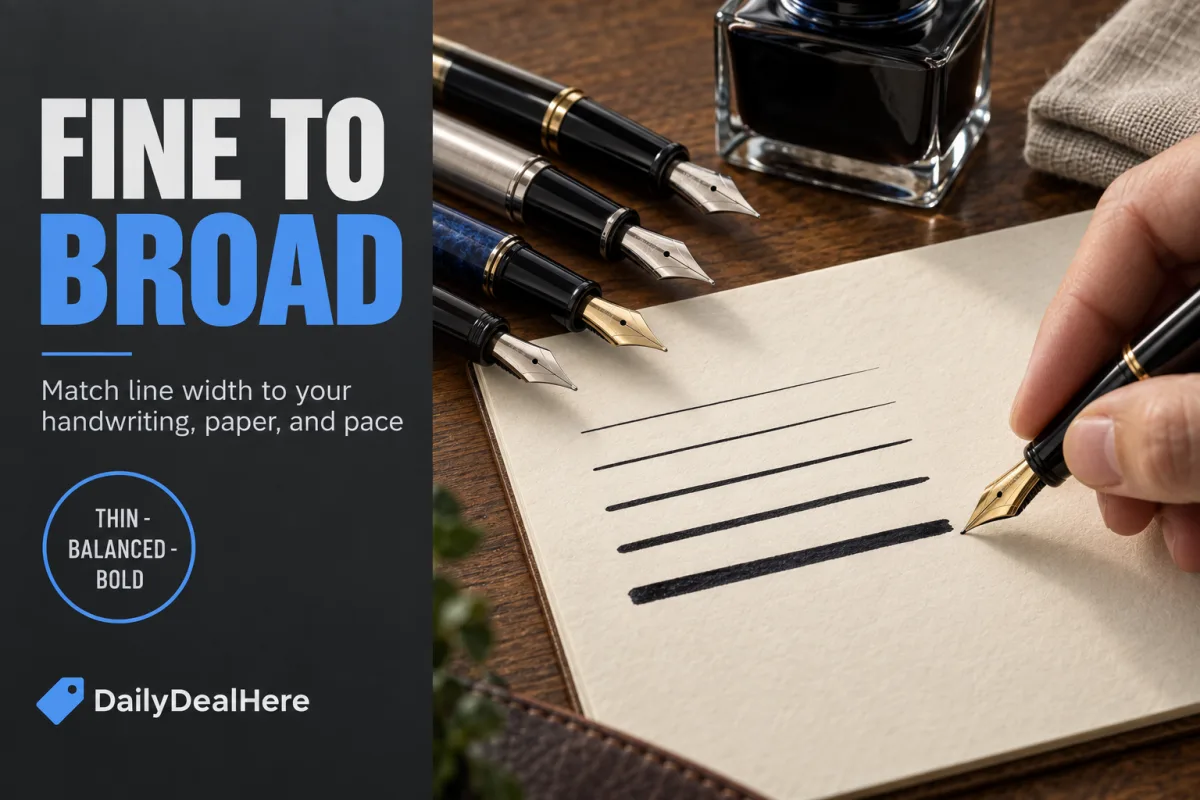
Binder lists five basic grades: extra fine (XF or EF), fine (F), medium (M), broad (B) and double broad (BB). Some makers add a triple broad. The crucial point is that there is no international standard for the exact tip size of each grade, so one maker’s fine can be noticeably different from another’s. Binder also notes that modern nibs seem to run a little larger than vintage nibs of the same designation.
| Grade | Typical use | What to expect |
|---|---|---|
| Extra fine (XF, EF) | Very small handwriting, margin notes, planners | Crisp, thin lines. Feels more feedback on the page. |
| Fine (F) | Everyday writing on ordinary paper | A safe default for most hands, especially in Western brands. |
| Medium (M) | Everyday writing, signatures, letters | Shows more ink color and tends to feel smoother. |
| Broad (B) | Larger handwriting, headings, showing off ink | Wet, bold lines. Needs good paper and longer drying time. |
| Double broad (BB) | Headlines, signatures, very large script | Very wet. More of a display nib than a daily writer. |
Binder adds a practical note on ink flow. The slit has to be tuned to the grade. An extra fine needs a very tight slit so it does not throw too much ink, while a double broad needs a much wider one to supply the volume it lays down.
Japanese versus Western nib sizes
This is the single most useful thing to know before buying a nib online. Binder says Japanese nibs tend to be a little finer than their Western equivalents, and that a Japanese medium is about the same size as a European fine. Wikipedia makes the same general observation that Japanese nibs are often thinner.
- If you like a Western fine, try a Japanese medium.
- If a Western extra fine still feels too broad, a Japanese extra fine is the logical next step. Binder suggests it for anyone who writes with a tiny, spidery hand.
- If you are moving from Japanese pens to European ones, drop down a size.
Because there is no standard, even this rule is approximate. When you can, compare writing samples from the exact model you are considering rather than relying on the letter stamped on the nib.
Which nibs write the finest line
The finest standard nibs are generally Japanese extra fine grades, for the sizing reasons above. Specialty grinds finer than extra fine also exist, usually called needlepoints, and Binder notes that even a needlepoint can be remarkably smooth when used with a very light touch.
Fine nibs come with one trade off that surprises people: they feel less smooth. Binder’s explanation is that very fine nibs are not inherently scratchy, but it is harder to make a very fine nib feel smooth, and a well finished extra fine will still feel rougher than a well finished medium. The reason is scale, which the next section explains.
Which nibs feel smoothest, and why
Binder uses a memorable comparison. Every paper surface is rough at a microscopic level. A very fine nib is like a shopping cart wheel in a parking lot, bouncing over every tiny bump. A medium or broad nib is like a car wheel, big enough to roll over the same bumps without noticing them. So, all else being equal, broader nibs feel smoother.
The second factor is pressure. Ink acts as a lubricant between nib and paper, and Binder explains that pressing down squeezes that ink out and brings back the rough feel. His advice is to let the pen do the work with almost no pressure, and he says even a needlepoint can be remarkably smooth when the tip just grazes the paper. For people coming from ballpoints, which need firm pressure, learning a lighter touch often matters more than buying a different nib.
There is also a limit to smoothness. In his article on nib basics, Binder describes slit edges that have been rounded too much. Those nibs feel very smooth but can struggle to start writing, because capillary action holds the ink back from the paper. He calls the condition “baby’s bottom.” A little feedback is not a defect. A nib that skips or needs a push to start is.
Round, stub, italic and oblique: the four tip shapes
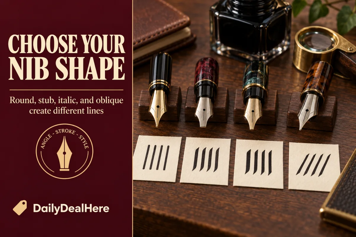
Binder groups nib tips into three basic shapes, round, stub and italic, with oblique nibs as a slanted variation. Here is how they compare.
| Tip shape | Line character | Ease of use | Best for |
|---|---|---|---|
| Round | Fairly uniform width in every direction | Easiest. Forgives rotation and angle. | Everyday writing, first pens |
| Stub | Mild thick and thin variation | Nearly as easy as round, with a small sweet spot | Adding character to normal handwriting |
| Cursive italic | Strong variation, slightly softened edges | Moderate. Works at a wider range of angles than a crisp italic. | Fast italic handwriting |
| Crisp italic | Sharp, high contrast strokes | Demanding. Must be held at a precise angle and written slowly. | Lettering and calligraphic styles |
| Oblique | Round or italic, cut on a slant | Only comfortable if you naturally rotate the pen | Writers who roll the pen in their hand |
A duo point nib is a less common variation Binder mentions: a round nib ground so it can also be used upside down for a finer line, in effect giving two grades in one pen.
Stub nibs: the easiest way to add character
Binder describes a stub as a nib elongated sideways, with a slightly elliptical footprint and well rounded edges. It lays down a slightly broader line on up and down strokes and a narrower one on sideways strokes. Because the edges are rounded, you can write with a stub almost as easily as with a standard nib.
Stubs do have a more pronounced sweet spot than round nibs, the area that writes most smoothly, but Binder says it is easy to find and that with a little practice you can stay in it at essentially normal writing speed. He also notes that a stub can be made with more extreme variation, but the more extreme the variation, the less smooth it becomes, which is why most stubs stay moderate.
For size, Binder suggests that people with small handwriting can usually write normally with a fine or medium stub in roughly the 0.6 to 1.0 millimeter range. Wider stubs suit larger handwriting and headings.
Italic nibs, crisp and cursive
An italic is much more elongated than a stub. Binder describes the standard italic as three or four times as broad at the tip as it is thick, with relatively sharp edges and corners. The result is a strong contrast between broad and thin strokes, the look associated with chancery and blackletter styles.
That crispness has costs. Binder explains that an italic works well only at one precise rotation in the hand and within a limited range of angles to the paper. Roll the pen and one side lifts, the ink line cuts out, and a corner may dig in. Writing too fast with an italic tends to produce scratchiness and skips. This is why you cannot simply pick up an italic and dash off a quick note.
The compromise is the cursive italic. Its edges and corners are rounded a little more, which reduces line variation slightly but gives a larger sweet spot and a nib that does not dig in when rotated. Binder says a properly ground cursive italic can produce variation almost as strong as an italic while writing nearly as smoothly as a stub of similar width. For everyday italic handwriting, it is usually the better choice.
Oblique nibs and whether you need one
An oblique nib is ground at a slant so that it sits flat on the paper when you hold the pen rotated in your hand. Binder is careful to explain that rotation here means rolling the pen around its long axis, not turning your wrist to point in a different direction.
His method for finding out whether you need one is simple and needs a friend. Post a pen so the clip lines up with the top of the nib, write normally without thinking about how you hold it, and have your friend watch the clip. If the nib stays straight, you do not need an oblique, and using one would force you to think about your grip every time you start writing. If you rotate counterclockwise, a left foot oblique suits you. If you rotate clockwise, a right foot oblique does.
Watch the naming. Binder notes that manufacturers’ oblique designations are inconsistent, with some calling the same nib a left oblique because of its slant and others a right oblique because right handed writers use it most. Check which way a particular maker means before you order. He also notes that most modern obliques are simply round nibs cut on a slant rather than oblique italics, so they accommodate rotation without adding line variation.
Nibs for left handed writers
There is no single left handed nib, because left handed writers hold pens in so many different ways. Binder describes overwriters, whose hand passes above the line of text, and underwriters, whose hand passes below it on clean paper. As a general rule, he says a right handed writer or a left handed overwriter would use a left foot oblique for italic effects, and a left handed underwriter would use a right foot oblique.
His broader point is that general rules only go so far. Stroke direction for a left handed writer depends on hand position and paper angle, so the thick and thin strokes of a stub or italic may fall in unexpected places. A round fine or medium is the safest start, followed by a gentle stub, with oblique and italic grinds best chosen after watching how you actually hold the pen. Quick drying ink helps overwriters in particular, since the hand passes over fresh writing.
Are gold nibs better than steel?
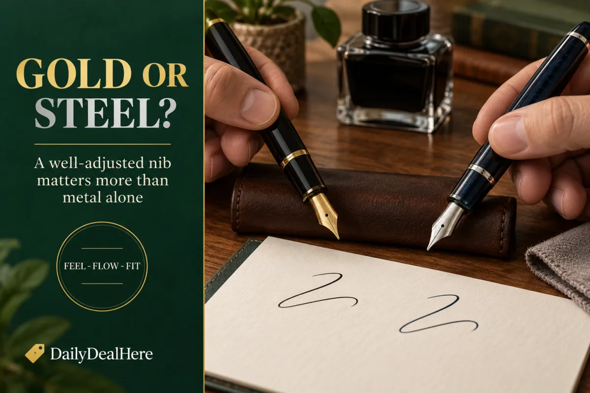
This is the most asked question about nibs, and Binder’s answer in his article on nib materials is more nuanced than most marketing. He starts by quoting pen historian David Nishimura: focusing on the gold content of a nib is like picking a wine by its alcohol content.
Gold’s real advantage is corrosion resistance. Binder calls it the most corrosion resistant chemical element known, which is why high quality 19th century dip pens were made of it. Pure gold is too soft for a nib, so it is always alloyed. Around 14K, he says, alloys combine superb writing characteristics with excellent corrosion resistance. Higher gold alloys such as many 18K nibs tend to be springy or soft, which is not the same as true flexibility, and he warns that owners who believe the sales hype sometimes spring 18K nibs by pressing harder than the nib can handle.
Steel nibs are stainless steel, which Binder describes as not perfectly stainless but staining less. Even the best steel nibs do not resist corrosion as well as gold, but they cost much less than any precious metal nib. His summary pecking order is 14K gold first, with 10K gold and palladium silver also surprisingly good, 18K good but not the very best, and steel much less costly but still very good indeed.
In practical terms, a well made, well adjusted steel nib is a far better writer than a poorly adjusted gold one. Gold makes most sense when you want longevity, a particular feel, or a specific model that only comes with gold. It is not a shortcut to a smoother line.
Other nib materials: palladium, platinum and titanium
Binder’s materials article also covers the less common metals.
- Palladium. In general, palladium nibs behave much like gold nibs and resist corrosion well, but they are not as good as gold for flexible nibs. Esterbrook used a palladium alloy during World War II, and Sheaffer used palladium silver alloys from the 1950s to save cost.
- Very high karat gold. During the 1970s, Japanese makers competed on gold content, reaching 23K and a nib Sailor branded as 24K. Binder says that nib was so soft a fingernail could scratch it and it did not last long on the market.
- Platinum. Platinum’s answer to that contest was a platinum alloy nib. Binder says it worked but did not justify its cost and was soon retired.
- Titanium. Binder describes titanium nibs as having a soft, springy feel but warns they are easy to spring and harder to repair than gold or steel, and that titanium does not wick ink as reliably as precious metals.
For most buyers, the practical choice is still between steel and 14K or 18K gold. The other metals are interesting, but none is an automatic upgrade.
What the “iridium” tip really is
Many nibs are described as iridium tipped. Wikipedia explains that gold and most steel and titanium nibs are tipped with a hard, wear resistant alloy that typically includes platinum group metals, and that while the material is often called iridium, few if any makers have used tipping alloys containing iridium since the mid 1950s. Osmium, rhenium, ruthenium and tungsten are used instead, generally as an alloy welded onto the nib and then ground to shape.
The takeaway is that the tipping, not the nib body, is what wears against the paper. Wikipedia notes that untipped steel and titanium points wear more rapidly. The quality of the grind and polish on that tipping is what you feel as smoothness, whatever the nib body is made of.
Flex nibs: what they are and what they are not
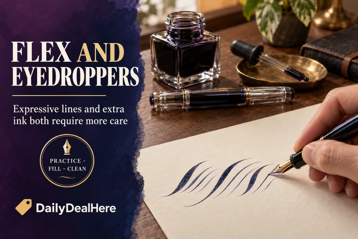
A flex nib creates line variation in a completely different way from an italic. Binder explains that a flex nib has an ordinary round tip, but its tines are longer and thinner than usual. As you press, the tines spread and the line widens. Release, and they close again. Because the variation follows your pressure rather than the direction of the stroke, the result is unique to your hand. Down strokes can swell and taper within a single letter, something an italic cannot do.
Binder also notes that the tine tips of a flex nib press gently together at rest, unlike most firm nibs, so the ink flow can start before the tines begin to spread. Wikipedia adds that flex nibs were much more common on pens made before the 1930s.
What a flex nib is not: a shortcut to beautiful handwriting. Binder is blunt that most people cannot pick one up and start writing wedding invitations. Learning to control a flex nib takes patience and practice, and he stresses that for the majority of users firm nibs are actually the better tool.
Semiflex, flex and wet noodles, and the modern soft nib
Flex comes in degrees. Binder describes semiflexible, flexible and superflexible nibs, and explains that a superflex will do under light pressure what a semiflex does with more. Semiflex nibs are easier to use but give less dramatic variation. The most flexible vintage nibs are nicknamed wet noodles, and Binder lists examples such as the Mabie Todd Swan, Remex eyedroppers, Moore’s Non-Leakable and Waterman’s pens including the No. 52.
Modern nibs are a different story. Binder writes that no modern manufacturer produces flexible nibs like the old superflexible nibs, and that the tempering of modern nibs differs from vintage practice, so even a modern nib modified by the best technicians cannot be flexed as far. Wikipedia makes the same point, stating that no current manufacturer makes nibs with an equivalent level of flexibility to vintage flex nibs.
Many modern nibs are sold as “soft.” Binder describes the widely known Namiki and Pilot Falcon as having a nib that is semiflexible at best, sold as soft and not intended for use as a true flex nib. He also explains that many modern nibs that appear to flex are really just springy, and much of the extra line width comes from a wetter line as the nib lifts from the feed. Soft nibs are pleasant to write with, but buy one for its cushioned feel, not for copperplate.
If you want real flex, Binder’s advice is to seek out a good vintage pen or consult a nib technician, and he notes that the best results in modified modern nibs usually come from 14K gold, since most 18K alloys are either too soft or too stiff to respond well.
How to avoid springing a flex nib
A sprung nib is one that has been pushed so far it can no longer return to its original shape. Binder describes the result as creases or cracks near the breather hole, and in his article on flex he explains the process as a set of zones. In the safe range, the nib flexes and returns. Push harder into a middle zone and each stroke overstresses the metal. Go past the point of no return and the nib suddenly needs much less force to bend much further, and it stays bent.
- Do not chase the widest possible line. Binder notes that skilled flex writers keep well inside the safe range rather than forcing extra width.
- Ease off on upstrokes, which are naturally light in flex writing.
- Start with a semiflex nib and a slower pace before trying anything more flexible.
- Never try to make a firm modern nib behave like a flex nib by pressing harder.
- If you want more flex than a nib has, have it professionally modified rather than forcing it.
Binder’s closing advice on flex is worth repeating: experiment with flexible nibs, since they are one of the most remarkable aspects of writing with a fountain pen, but do not ask too much of them.
Eyedropper fountain pens
An eyedropper pen, as Goulet Pens defines it, is a fountain pen in which you can fill the entire barrel with ink. It is the oldest filling system of all. Binder’s history of the design explains that the section unscrews from the barrel, ink is dripped in with an eyedropper, and the section is screwed back on. For decades it was simply the regular fountain pen, until self filling designs such as the lever filler took over.
The appeal today is capacity. Goulet lists massive ink capacity as the headline advantage, along with the look of a clear demonstrator barrel full of ink and freedom from cartridges and converters. Binder notes the design has enjoyed a renaissance among users for whom ink capacity is paramount.
The tradeoffs are real. Goulet lists more complicated filling, a greater risk of leaking or burping, and more involved cleaning because ink gets into the whole pen. Binder’s history notes that early eyedroppers could leak at the joint if not screwed tightly enough, yet be hard to open again if screwed too tightly.
Choosing and living with an eyedropper pen
There are two routes. Some pens are designed as eyedroppers from the start. Goulet names the Opus 88 and the Namiki Emperor, and Binder mentions the Wality 69L from India. Others are cartridge or converter pens that can be converted. Goulet’s examples include the Platinum Preppy, Noodler’s Ahab, Kaweco Sport, and pens from Edison and Maiora. Binder mentions the Bexley 58, which uses an O-ring seal for eyedropper use. Always confirm with the maker before converting a pen, since not every barrel is suitable.
- Seal the threads. Goulet lists silicone grease as the minimum supply for a conversion and an O-ring as ideal.
- Do not overfill. Goulet advises filling the body up to the threads but not quite to the top. Binder’s filling instructions say to stop about a quarter inch from the opening.
- Watch the temperature. Goulet explains that burping, an unexpected drop of ink, gets worse as pressure in the pen rises, and that the warmth of a pen resting in the crook of your hand builds that pressure. Air expands as it warms, and that extra pressure pushes ink out through the feed.
- Screw it closed firmly. Binder’s instructions stress screwing the section back tightly enough that it will not leak, then wiping away any ink on the outside.
- Plan your cleaning. Flushing a full barrel takes longer than rinsing a converter, so pick inks you are happy to keep in the pen for a while.
An eyedropper is a great choice for long writing sessions at a desk, heavy journaling, or anyone tired of refilling. It is a less natural fit for a pen that lives in a shirt pocket or travels constantly. If you fill a journal every month, it pairs naturally with a thick notebook. Our guide to the best spiral bullet journals covers options that lie flat for long sessions.
Common nib problems and what causes them
Binder’s article on nib basics lists the problems people most often blame on a nib, and many have simple causes.
- Too dry or too wet. Often the slit is too narrow or too wide for your writing style. As a general rule, Binder says the tines of a firm nib should not touch each other at rest. Flex nibs are the exception.
- Skipping or losing the line. Nibs with straight slits occasionally lose capillary action, more often in broad grades. A slit that is wider at the tip than at the breather hole, often from a sprung nib, is a much worse version of the same problem.
- Hard starting. The most common nib related cause is slit edges that are rounded too much, the “baby’s bottom” condition. The nib then needs a little push to start.
- Scratchiness. Slit edges that are not rounded enough, or tines that are out of alignment. Binder says sharp edges where the tipping was slit are the next most common cause after alignment, and not something to fix at home.
- Dirt and fibers. Cheap paper can lodge fibers in the slit and restrict flow. Regular flushing helps.
If a nib keeps misbehaving after cleaning and a light touch, a nib technician can usually adjust it far more safely than you can with sandpaper and good intentions.
Buying fountain pen nibs as a gift
A fountain pen is a classic gift, but the nib is a personal choice. When you do not know how the recipient writes, a Western fine or a Japanese medium round nib is the least risky choice, since it suits the widest range of handwriting. Avoid flex, italic and oblique nibs as surprises. They are brilliant for the right person and frustrating for everyone else. If the pen has interchangeable nibs, that removes much of the risk. Our guide on how to shop for someone who has everything has more ideas for picking gifts people will actually use, and if the date is close, see our list of last minute gifts that still arrive on time.
How to choose your first, or next, nib
- Look at your handwriting. Small and tight suggests extra fine or fine. Large and loose suggests medium or broad.
- Adjust for origin. Remember that a Japanese medium is roughly a European fine.
- Decide on character. Want uniform lines? Choose round. Want a bit of flair with no new technique? Choose a stub. Want calligraphic contrast and willing to slow down? Choose a cursive italic.
- Check your grip. If you roll the pen in your hand, ask a friend to watch before considering an oblique.
- Choose the material by budget. A well adjusted steel nib is an excellent writer. If you move to gold, Binder’s view favors 14K over higher karat alloys.
- Treat flex and eyedropper pens as second or third pens, once you know what you like.
- Learn a light touch. It improves every nib you will ever own.
Binder’s own conclusion on nib styles is a good one to end on. Different people write in different ways, no nib style is right or wrong, and the only real mistake is never trying different ones.
Frequently asked questions
What are the best fountain pen nibs for everyday writing?
For most people, a fine or medium round nib. It writes evenly in every direction and forgives an imperfect grip. If you want a little line variation without learning a new technique, a fine or medium stub is the next best choice.
Which fountain pen has the finest nib?
Japanese extra fine nibs are generally the finest standard grades, because Japanese nibs run finer than Western nibs of the same label. Richard Binder notes a Japanese medium is about the same size as a European fine. Specialty needlepoint grinds go finer still.
Which fountain pen nib is the smoothest?
Broader nibs generally feel smoother than very fine ones, because a bigger tip rides over the microscopic roughness of paper. A light touch matters as much as the nib, since pressing down squeezes out the ink that lubricates the tip.
Are gold nibs better than steel?
Not automatically. Gold resists corrosion better, and Richard Binder ranks 14K gold as the best nib material, with 18K good but not the very best. Steel nibs cost much less and can still be very good. A well adjusted steel nib writes better than a poorly adjusted gold one.
What is the best material for fountain pen nibs?
In Richard Binder’s pecking order, 14K gold is best, 10K gold and palladium silver are surprisingly good, 18K is good but not the very best, and steel is much less costly but still very good. He advises against titanium and brass for serious writing.
Are there modern flex nib fountain pens?
Some modern pens have soft or semiflexible nibs, such as the Pilot and Namiki Falcon, but Richard Binder and Wikipedia both state that no current maker produces nibs as flexible as the best vintage flex nibs. For true flex, most people look to vintage pens or a nib technician.
What is an eyedropper fountain pen?
A fountain pen in which the whole barrel holds the ink. You unscrew the section, fill the barrel with an eyedropper or syringe, and screw it back together with silicone grease or an O-ring sealing the threads. It offers huge ink capacity but needs more care with filling, burping and cleaning.
Why does my eyedropper pen drip ink?
Usually because air in the barrel expands as the pen warms, often from resting in your hand, and pushes ink out through the feed. Goulet Pens calls this burping and notes it gets worse as pressure in the pen rises. Avoid warming the pen unnecessarily, such as resting it in your hand while you are not writing.
Pick a round fine or medium for daily use, add a stub when you want character, save flex and eyedroppers for when you know what you like, and write with the lightest touch you can manage.









Write Your Review
No reviews yet. Be the first to share your experience!